| |
||
|
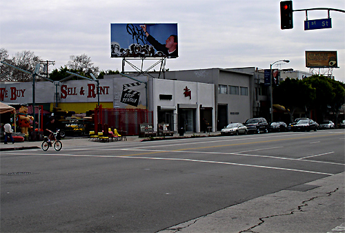
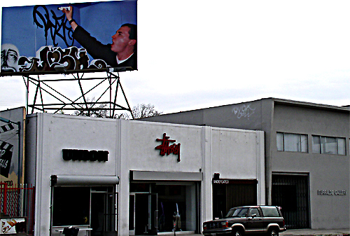
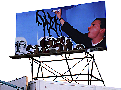
Billboard found on LaBrea Ave. in Los Angeles.... |
||
|
|
||
Take notice of the small Nike symbol on the lower
right corner that
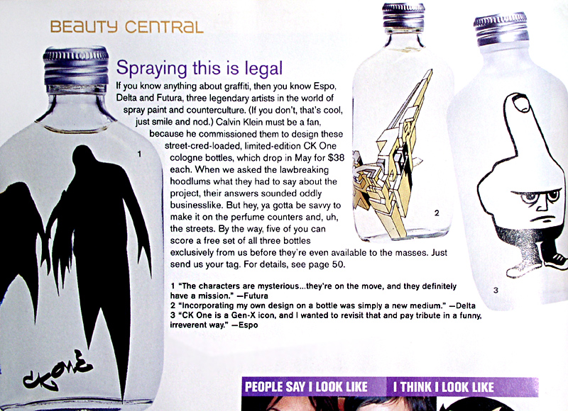
In the magazine article below, Calvin Klein commissioned
graffiti artists NOTE: The depictions of the bottles only show one side of the design. |
||
|
||
|
|
I had some questions for ESPO about that middle finger character on the bottle and tons of other shit came up during the discussion about the CKOne commisioned project that is important for everyone to take a look at... ----------------------------------------------------------------------------------- DAUS: Hey ESPO, I wanted to know your position on undertaking this opportunity. ESPO: I was actually avoiding taking it until people told me what a big Shot Fabian Baron was and I should jump at the chance to work with him. He was the designer on the original CKone bottle and responsible partly for the print campaign with the heroin-chic models DAUS: I also wanted to know if there was a particular angle that the company approached you three with, or if there was some standard of design they were imposing on you guys - for instance "no graffiti letters - think more along the lines of graphic design". ESPO: No, I had a couple of sketch book pages filled with ideas. the first one was a dog sniffing another dog's butt and the back of the bottle said "you smell nice". From that first mean idea, they just got worse and worse, over the course of the 2 pages. I sold him on the idea of the three models (based on that notorious CKone campaign) on the front of the bottle, (btw, they are letters) while the fouth letter on the back was to be a fat guy eating chicken. he wouldn't let the middle finger guy go, so he combined the two. So the models on the front are couture and the guy on the back is punk rock, but it's all fashion, and it says espo. it's a joke, a diss, a statement and a name all in one. DAUS: I do have a question about CK's intentions and your feelings about them. Obviously they wanted to hire graffiti artists to design the bottles but why do you think they wanted to do that? To sell more bottles of CKOne? I doubt it especially since the designs I have seen dont really refference graffiti besides the fact that they are designed by graff artists. I imagine that the majority of people who buy CK products dont even know who you guys are. So going back to my drawn out question, why do you think CK hired graffiti artists and how do you feel about it all? ESPO: I think it was a good way for them to pump some new interest in the brand. I think it's already generated a good amount of publicity, so sales may be secondary. They were interested in using artists from a variety of sectors, and graffiti works since it's something the kids are naturally interested in. It was another opportunity to play myself, but thanks to CK letting me be me, I was able to get over one more time. It's also set a standard for any other company who wants to deal with me, so I'm cool with all of it. I gotta shout out Chris Johanson, he handles the commercial work with sarcasm and flair. We are all at work trying to navigate the commercial straits without getting played. I know theres a ton of corny graff merchandizing, but as long as the people you know and love are coming correct, things are good. Besides, with writers getting hauled off to jail, we need all the wack commercial merchandizing we can get, anything to make people stop demonizing graff. More commercials, more museum shows, and maybe the soccer moms and dads will calm down. |
|